Why I use R (2019-03)
As I love programming and know many different languages, people are often surprised — to be polite — that I use R to analyze and visualize data.
The goal of this post is to explain why.
My personal history with R — AKA why I avoided R like plague for long
Main mistakes to avoid in R — Quick list for those in a hurry
Showcase — Shows R’s potential conciseness, tunability and visualization output quality
Final word — Shameful propaganda on why you should think about using R
My personal history with R
I have been confronted with R several times in college, notably for statistics and machine learning classes. These classes included an introduction to programming in R: Concepts, syntax, data frames… Here are the first impressions I had after such classes.
WTF is this syntax?
Is it really so slow? Some benchmarks highlighted crazy performance drop (50+ times slower than C).
My conclusion was simple at this time. Programming in R? No way. I therefore used different technologies to analyze and visualize data for several years such as Python’s (pandas + matplotlib), LaTeX’s pgfplots, gnuplot, spreadsheet…
But I completely changed my mind about R at the middle of my PhD. The main reasons for me to go for R were the following.
I needed to do a lot of data analysis and visualization at this time — I was trying to gain insight about the behavior of some algorithms.
I felt that the technologies I used were limiting me. I was mostly using Python at this time. I felt that matplotlib was clearly too low-level for what I needed. pandas gave nice wrappers around matplotlib in simple cases, but tuning the visualization for advanced cases was tedious.
A wise man told me “If you are programming in R, you are doing it wrong! R is not a programming language, R is a tool to analyze and visualize data.”.
A R guru showed me how expressive, tunable and powerful R can be with the proper packages (tidyverse). He also showed me how great R visualizations can look.
Since then, I have been using R for most of my data analysis/visualization needs.
Main mistakes to avoid in R
Programming in R. R can be a great tool to modify data and to analyze it. But if you plan to compare your data to complex things — mmh, let’s say, simulation data — do not implement your simulator in R.
Using vanilla R. R without packages is not worth the language flaws. Especially, I think that without tidyverse I would not use R at all. I therefore recommend to learn R+tidyverse rather than R alone.
Showcase
First, we need data to analyze and visualize.
I found a CC0 dataset about Olympics results there,
let’s talk about sports today.
I generated a data subset and hosted it here to make things easy.
Fun fact: While the original data has been gathered in R,
I also used R to create a subset of the data with the following script.
# Read input data.
data = read_csv(args$"<INPUT-FILE>") %>%
    # Apply some filters to only keep some entries.
    # Only keep entries about females, in Winter, since 2000.
    filter(Sex == "F" & Season == "Winter" & Year >= 2000) %>%
    # Save the filtered data in another file.
    write_csv(args$"<OUTPUT-FILE>")
From now on, I’ll assume that you have downloaded the
data subset
in your /tmp directory.
What I usually do first with data is to load it (thanks, captain obvious) then
to print a summary about it. Vanilla R is very straightforward about this.
data = read.csv("/tmp/athlete_events_subset.csv.gz")
summary(data)
And here is the output R printed.
      ID                                               Name
Min.   :   126   Marit Bjrgen                            :  19
1st Qu.: 40736   Evi Sachenbacher-Stehle                 :  18
Median : 71120   Macarena Mara Simari Birkner            :  18
Mean   : 72159   Chimene Mary "Chemmy" Alcott (-Crawford):  17
3rd Qu.:105484   Teja Gregorin                           :  17
Max.   :135550   Andrea Henkel (-Burke)                  :  16
                 (Other)                                 :7104
   Sex               Age            Height        Weight
Mode :logical   Min.   :14.00   Min.   :146   Min.   :38.00
FALSE:7209      1st Qu.:22.00   1st Qu.:163   1st Qu.:55.00
                Median :25.00   Median :167   Median :60.00
                Mean   :25.25   Mean   :167   Mean   :60.46
                3rd Qu.:28.00   3rd Qu.:171   3rd Qu.:65.00
                Max.   :48.00   Max.   :194   Max.   :96.00
                                NA's   :23    NA's   :143
           Team           NOC               Games           Year
United States: 537   USA    : 576   2002 Winter:1582   Min.   :2002
Canada       : 502   CAN    : 533   2006 Winter:1757   1st Qu.:2006
Russia       : 460   RUS    : 491   2010 Winter:1847   Median :2010
Germany      : 440   GER    : 468   2014 Winter:2023   Mean   :2008
Italy        : 369   ITA    : 383                      3rd Qu.:2014
Japan        : 343   JPN    : 343                      Max.   :2014
(Other)      :4558   (Other):4415
   Season                 City                            Sport
Winter:7209   Salt Lake City:1582   Cross Country Skiing     :1419
              Sochi         :2023   Biathlon                 :1276
              Torino        :1757   Alpine Skiing            :1122
              Vancouver     :1847   Speed Skating            : 695
                                    Ice Hockey               : 634
                                    Short Track Speed Skating: 513
                                    (Other)                  :1550
                                       Event         Medal
Ice Hockey Women's Ice Hockey             : 634   Bronze: 309
Biathlon Women's 7.5 kilometres Sprint    : 329   Gold  : 315
Biathlon Women's 15 kilometres            : 322   Silver: 309
Alpine Skiing Women's Giant Slalom        : 305   NA's  :6276
Alpine Skiing Women's Slalom              : 304
Cross Country Skiing Women's 10 kilometres: 286
(Other)                                   :5029
This summary is an amazing starting point! It directly shows different things.
Many columns have discrete values (Medal, Sport…). You have a direct overview of the distribution of values for these columns.
Many columns have numeric values (Weight, Year…). You have well-known descriptive statistics about each column. You can directly check that Years of study are between 2002 and 2014 for example.
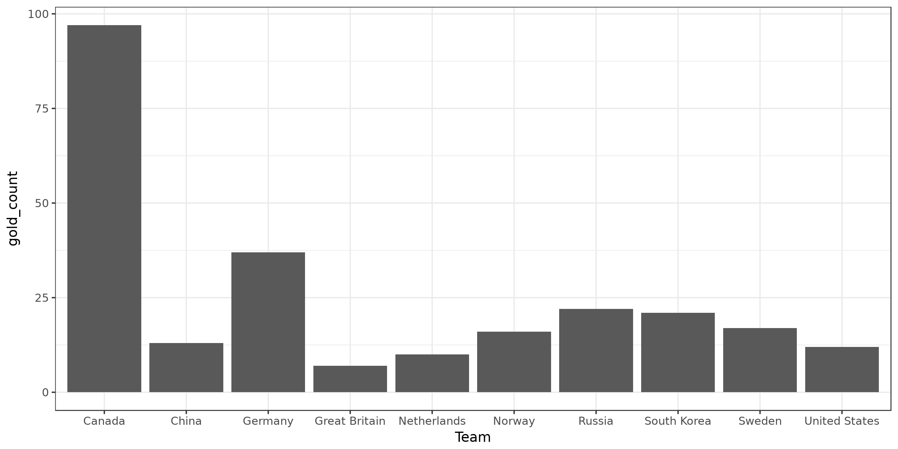
Now that we know a little more about the data, we can directly start analyzing it. This will be done thanks to tidyverse — dplyr to do usual data manipulations and ggplot to do visualization. Question 1: Globally, which countries have won the highest number of gold medals? The following R code explicitly computes it.
# Globally, which countries have won the highest number of gold medals?
gold_data = data %>%
    filter(Medal == 'Gold') %>% # Only keep entries about gold medals
    group_by(Team) %>% # Create a group for each country
    summarize(gold_count = n()) %>% # Count how many gold medals the country won.
                                    # Store it in a "gold_count" column.
    top_n(n=10, wt=gold_count) %>% # Only keep top 10 countries.
    arrange(desc(gold_count)) # Sort the data by number of gold medals.

# Print what we just computed
gold_data
# A tibble: 10 x 2
   Team          gold_count
   <fct>              <int>
 1 Canada                97
 2 Germany               37
 3 Russia                22
 4 South Korea           21
 5 Sweden                17
 6 Norway                16
 7 China                 13
 8 United States         12
 9 Netherlands           10
10 Great Britain          7
Okay that’s nice. But visualizing it should be even nicer.
# Visualize this data
ggplot(gold_data) + # Create a plot about gold_data
    geom_col(aes(x=Team, y=gold_count)) + # Add bar charts in the plot
    theme_bw() + # Cosmetics for a black and white plot
    ggsave("./data/top-gold-countries-bc.png", width=10, height=5) # Save the plot in a file
Okay, we visualized something. However, these operations may seem complex to obtain such a simple plot. And indeed, the explicit computations can directly be done by ggplot in such cases. The good thing with tidyverse is that doing way more complex plots does not require much more work that what we did. Question 2: Globally, how medals are distributed among the previous countries?
# Globally, how medals are distributed among the previous countries?
ggplot(data %>%
        filter(Team %in% gold_data$Team) %>% # Only keep entries from the selected countries.
        filter(Medal %in% c('Gold', 'Silver', 'Bronze'))) + # Only keep entries that got a medal.
    geom_bar(aes(x=Team, fill=Medal)) + # Add an histogram (bar chart about distribution) in the plot
    scale_fill_manual(values=c("#824A02", "#FEE101", "#D7D7D7")) + # Custom colors
    theme_bw() +
    ggsave("./data/top-medal-distribution.png", width=10, height=5)
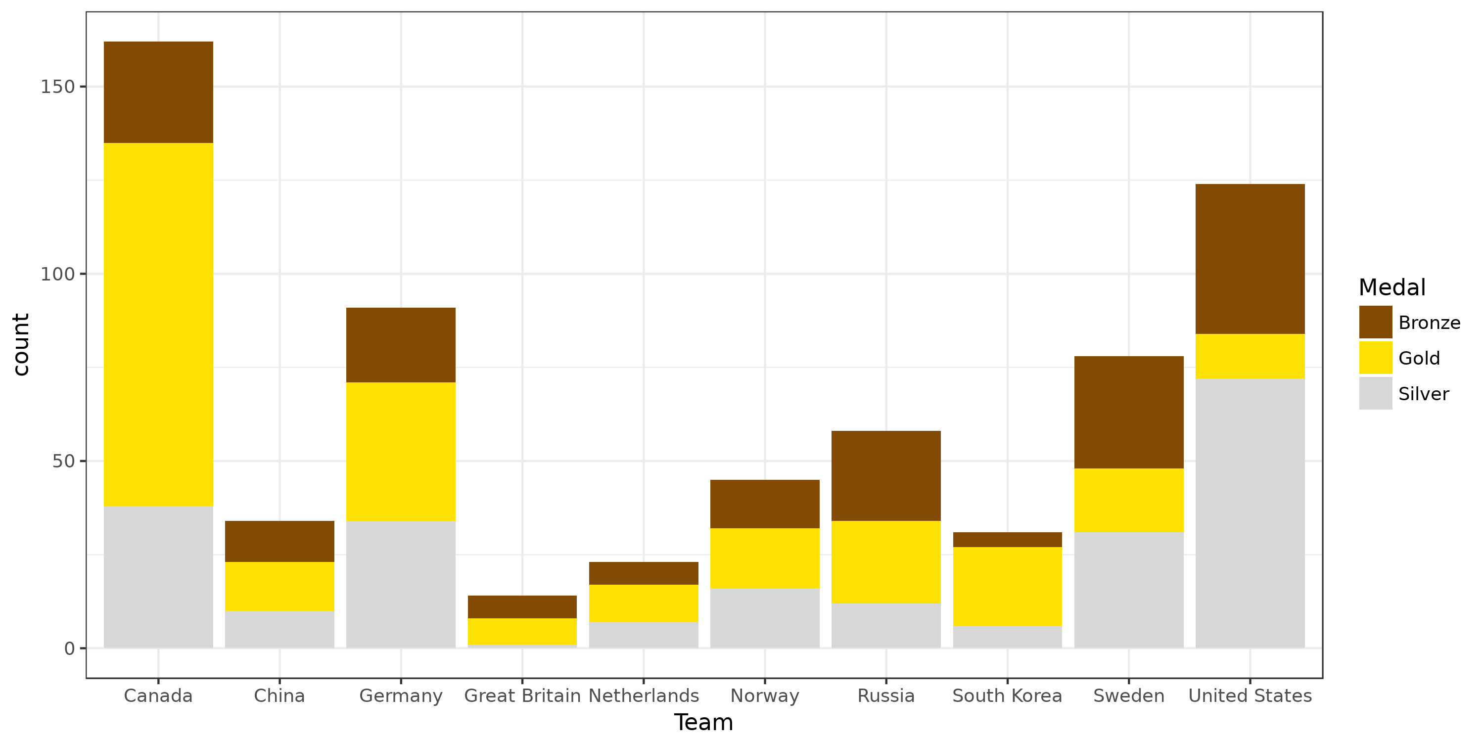
Okay, 7 lines to get such a plot! Question 3: How did the distribution of medals evolved over time for the global top 4 countries?
# How did the distribution of medals evolved over time for the global top 4 countries?
ggplot(data %>%
        filter(Team %in% c('Canada', 'United States', 'Germany', 'Sweden')) %>% # Only keep data for some countries
        filter(Medal %in% c('Gold', 'Silver', 'Bronze')) %>%
        group_by(Team, Medal, Year) %>% # Create groups on tuples!
        summarize(count=n())) + # Compute a count for each group
    geom_line(aes(x=Year, y=count, color=Team)) + # Add lines
    facet_wrap(~ Medal) + # Plot data of different Team on different facets
    scale_color_viridis(discrete=TRUE) + # colorblind-proof colors
    theme_bw() +
    ggsave("./data/top-medals-over-time.png", width=10, height=5)
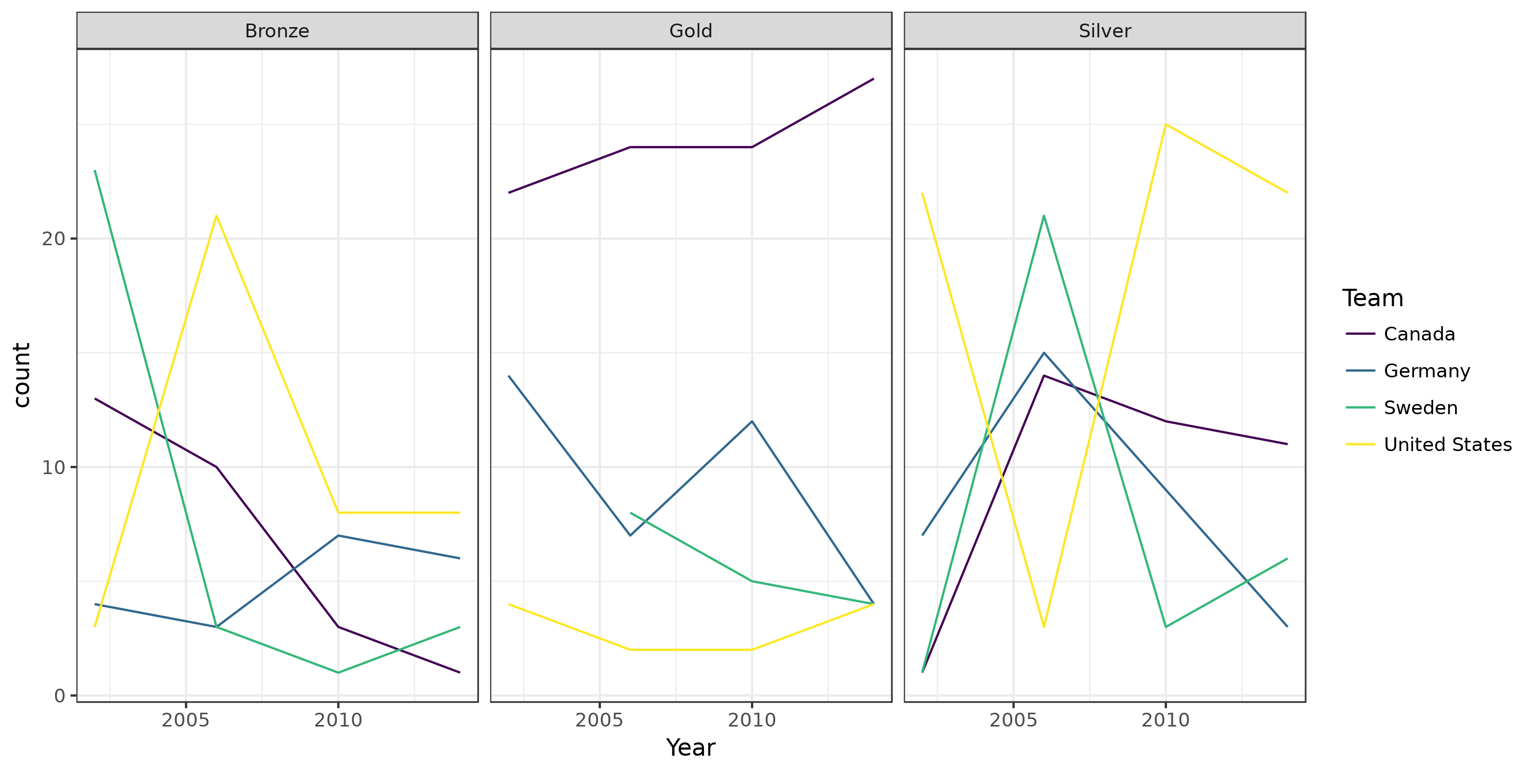
Okay, code looks very similar but the output plot is very different.
Here, we changed the ggplot function
(geom_line instead of geom_bar, to get lines instead of bars) and told it to separate data in facets.
On the dplyr side, we told it to compute summaries per groups, just as we did in the first example.
Groups were just tuples of columns, instead of a single column.
Final word
I hope this example showed how R + tidyverse allows to quickly analyze your data and to visualize it how you desire.
Once familiar with dplyr and ggplot, you can easily plot your data in similar ways and start thinking about how to visualize your data in the best possible way. Before switching to R + tidyverse, I often resigned to keep the only solution that I could make work after a reasonable amount of hours fighting against hard-to-tune APIs — and I do believe this is what happened for many papers out there.
The API and data structures of the different libraries are consistent, so you will not need to learn again what you already master. Documentation of the different functions is quite good and filled with examples, and finding an example close to what you want to achieve is usually straightforward on sites similar to stackoverflow.
This example focused on operations that are done all the time: Filtering, grouping, sorting, computing summaries per group, plotting data, plotting on different facets… tidyverse can do many other things, such as reshaping your data (tidyr), read data efficiency and safely (readr), have lots of fun with dates (lubridate)…